
The Challenge of Painting Water
How do artists paint water so realistically? Capturing the motion of the sea in a painting is a challenge most artists come across sooner or later. So, how then, do you as an artist achieve the realism that you're hoping for? For me, painting water begins with observation. I take note of how light touches the surface, how shadows sink into its depths, and how the constant pull of the tide creates ever-changing patterns. Water is never still, and that's what makes it such a rewarding subject. If you're trying this yourself, look not only at the shapes but at the flow — ask yourself, where is the water moving, and how can I guide the viewer's eye to follow that same path?
In the end, painting water is about balance: between movement and stillness, storm and calm, detail and suggestion. Each brushstroke is an opportunity to reflect not only what you see, but what you feel as you stand by the shore. And when you let that guide your hand, the water you paint will carry its own life across the canvas.
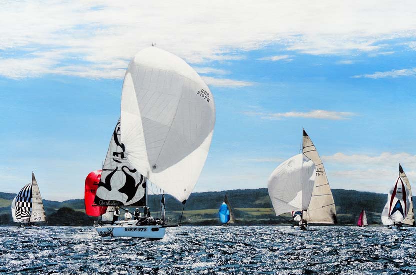
Seascapes and Maritime Art
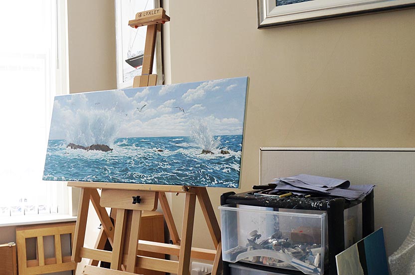
I enjoy observing the coastline and capturing glimpses of the world around me, so I often take reference photographs while I'm out and about. Back in the quiet of my studio, those photos become the seeds of my paintings. Every painting you see here was created within those four walls — some came together in just over a week, while others stretched into several months of work, depending on the size of the canvas and the level of detail I wanted to bring out. I don't paint outdoors, so this post isn't about Plein Air painting — rather, it's a peek into how I create from the comfort and rhythm of my studio space.
How to paint Water Realistically
When I begin a painting depicting water, the very first thing I think about is the composition. Before any brush touches the canvas, I pause and imagine the overall structure of the painting — where the eye will travel, how the waves might guide the viewer's gaze, and what part of the water will hold the greatest sense of energy or calm. Water has a natural rhythm, and composition is where I start to capture that.
Next, I turn my attention to light. For me, this is one of the most magical aspects of painting water. The way natural light plays across the surface changes everything — the depth of colour, the sparkle of highlights, the mood of the entire scene. On a bright day, the water can shimmer with silvers and crystalline blues, while under softer, overcast skies it may lean towards muted greens and greys. I spend time simply noticing how light shifts over the surface, because it is this shifting that makes the water feel alive when translated into paint.

Choosing my Colours
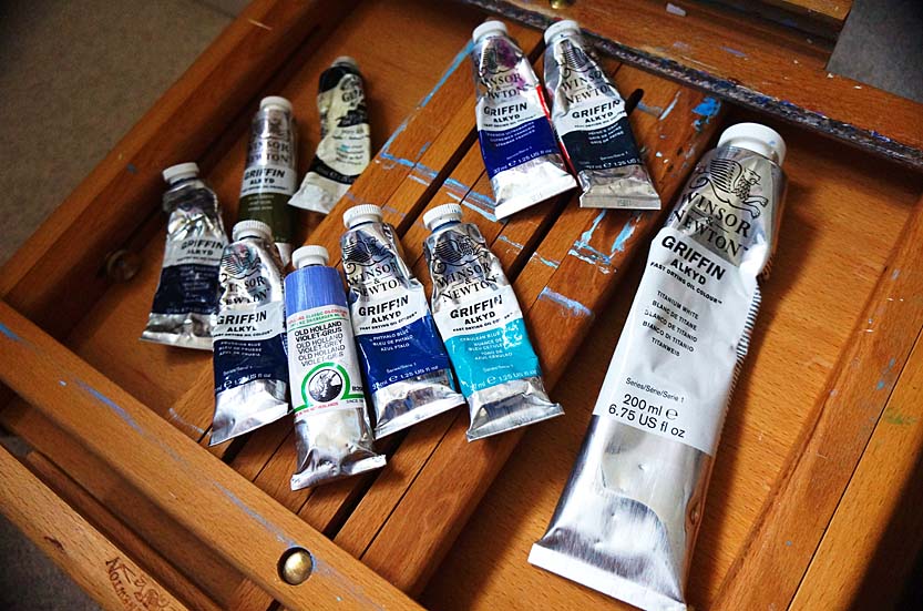
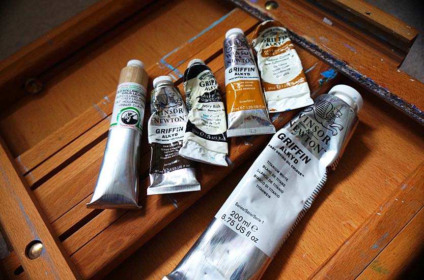
Once I have a sense of both composition and light, I begin to choose my palette. This stage feels like setting the emotional tone of the painting. I carefully select which blues and greens I'll rely on for the work — sometimes leaning towards warmer, turquoise tones for a sunlit shallows, and other times reaching for deeper ultramarines, Cobalt Blue or even Paynes-Grey to suggest strength and depth, and maybe mixing in some Old Holland Violet-grey with the blue, if required. For oil painting, the brands I use are Michael Harding, Old Holland, and Winsor and Newton Griffin Alkyd paints.
At the end of the day, it's all about the 'look' you're going for, when it comes to what colours work for you. If I decide to use a small amount of green on the water, I do have a preference for using Winsor and Newton or Old Holland Olive Green, mixed in with my choice of blue or black (if it is for shadows), so the area of water doesn't appear too green. I might also add earthier colours into the mix, especially if the water reflects rocks, sand or seaweed. I mostly use Raw Umber mixed with Ivory Black, for rocks, and then use lighter colours (Old Holland Warm-Grey or Winsor and Newton Raw Sienna, depending on the light and the time of day I am portraying in the scene) for painting the lighter areas on the rocks. Each choice of pigment is deliberate, because it will shape how the painting speaks to the viewer.
For me, these early stages are about laying the foundations of atmosphere. Composition, light, and colour all work together before I've even built up the first layers of paint. They give me a map to follow, but also the freedom to let the painting evolve naturally. By starting with this kind of thoughtful preparation, I find that the water begins to reveal its own story as I work, and I'm simply guiding it onto the canvas.
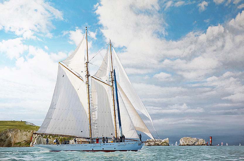
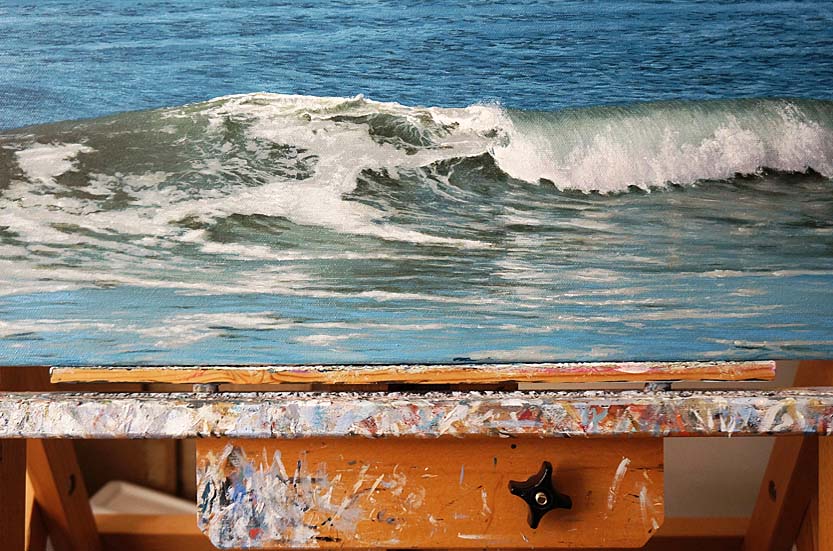
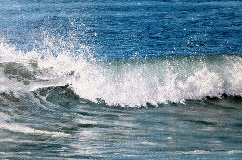
EXAMPLE ONE: PAINTING MOTION
When I stood at Cheyne Beach in Ilfracombe, watching the tide roll in, I knew I wanted to capture more than just the appearance of the water — I wanted to bring its movement and energy to life on canvas. The water there, along the North Devon coastline, has a particular strength: a rhythm that feels both untamed and deeply grounding. Translating that into paint became less about simply copying what I saw and more about recreating the feeling of being beside the water.
In this piece, I worked with oil paints in a series of layers. The first layers set the foundation, giving me the broad movement of the tide — the push and pull of waves as they gather and break. With each new layer, I added more nuance: softer transitions, sharper highlights, deeper shadows. This process of layering is essential when painting water, because it allows you to build depth and transparency, much like the sea itself.
Build Your Painting Gradually
What I found most exciting was how realism slowly revealed itself through this process. At first, it was just shapes and tones. Then, gradually, the surface began to shimmer, the currents began to twist and turn, and the whole painting started to breathe. For new artists, my advice is to be patient with this stage — don't rush to capture every ripple at once. Let the painting grow.
Method
When I work in oils, I always follow the principle of 'fat over lean'. It's a traditional method that guides the way paint layers are built up, and it makes a huge difference to both the stability and beauty of the finished work; so it's good to follow such helpful rules. In simple terms, the 'lean' layers come first — these are thinner mixtures of oil paint with more solvent (I use the new plant-based artists' solvents as they are almost odourless compared to traditional solvents and far better for the environment), which dry more quickly and provide a solid base.
As I continue to build the painting, each new layer becomes progressively 'fatter,' meaning I add more oil and less solvent to the paint. These richer, oilier layers dry more slowly and remain more flexible, which prevents cracking over time. By respecting this balance, the painting develops both in its physical surface and in the way the light plays through the transparent glazes and colours.


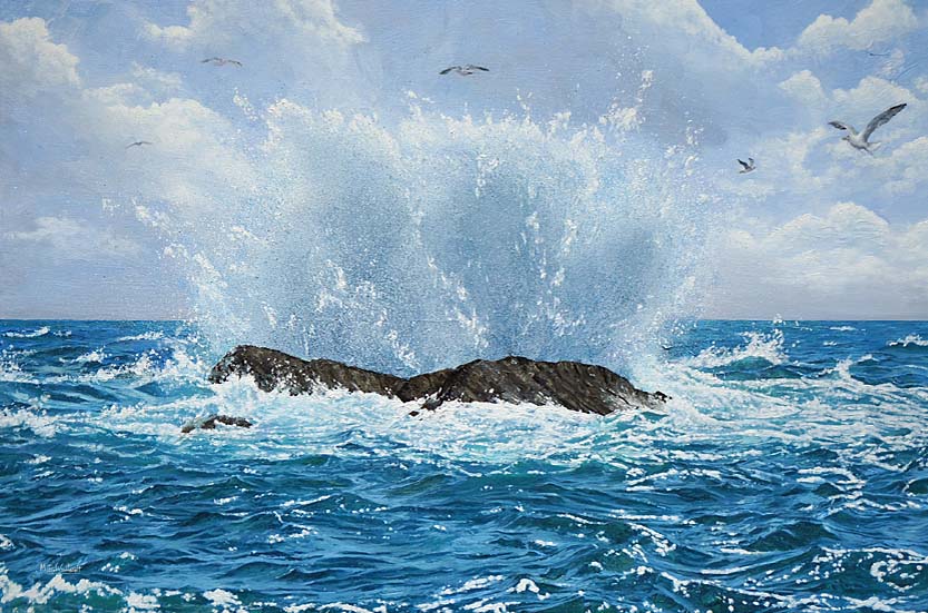
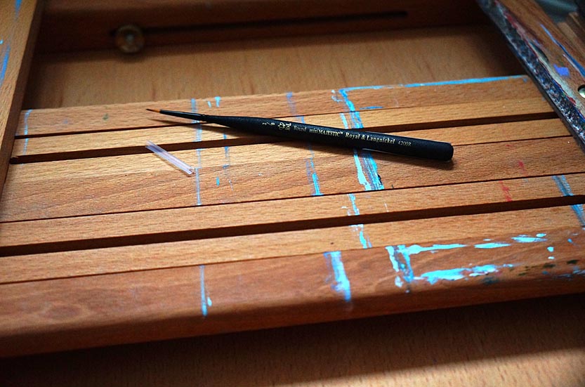
When I reach the stage where I paint the details of the water, with a small brush, this painted layer is where the real patience begins. It's the part of the process where the ripples and waves start to take on their true form, where the painting slowly shifts from suggestion to realism. I find this stage both meditative and demanding — it requires hours of careful observation and deliberate brushwork (using a mini Majestic Royal & Langnickel Round, size 2/0), but each stroke adds a little more life to the canvas.

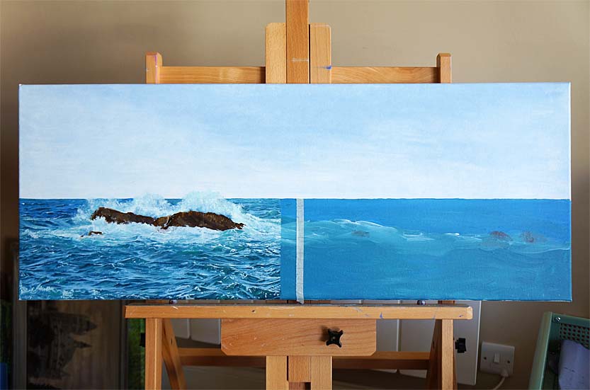
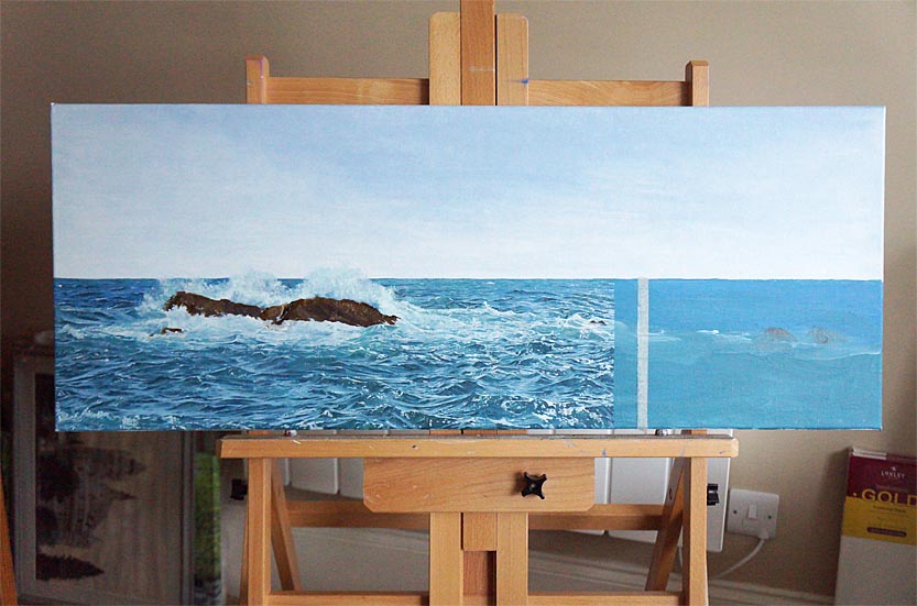
In this particular painting, I chose to work methodically, moving from left to right across the canvas. To manage such a large, detailed surface, I divided the painting into one-inch squares and focused on painting one column of squares at a time. It's almost like piecing together a puzzle, where every tiny section contains reflections, shadows, and shifting colours that all need to harmonize. By breaking the water down into smaller areas, I could give each ripple the attention it deserved without feeling overwhelmed by the scale of the whole. The process took me almost two weeks to complete this single detailed layer (between 5 to 9 hours at the easel every day), but the reward was watching the surface of the ocean gradually come alive before me, so it was definitely worth every hour spent.
Committing Yourself to Your Painting
I know that kind of time commitment might sound daunting, but I encourage you to give it a try. You may surprise yourself and even enjoy the quiet discipline of working this way. There's no need to set deadlines for yourself — let the painting grow at its own pace. The important thing is to be consistent and intentional with each section, because when the ripples finally connect across the canvas, the effect is incredibly satisfying.
Artist Tip
One practical tip I always follow is to preserve enough of the original paint mix to last me for the entire layer, or write down, for future reference, the exact ratios of paint in the mix. Painting water requires a delicate balance of colours, and even the slightest shift in tone can be noticeable if you mix a fresh batch halfway through. I keep my paints sealed and protected (with clear stretch film wrapped around the palette, so no air can reach the paint) so that I can return to the same mixture day after day, and then I add a little medium to keep it fluid. That way, the surface remains consistent, and the painted water flows seamlessly across the painting.
For me, this stage of detailed work is where patience transforms into beauty. Every ripple, every wave crest, is a reminder that realism is built not in haste but in careful, attentive hours. When you finally step back and see the whole stretch of water shimmering with movement, you'll know that every moment invested was worthwhile.
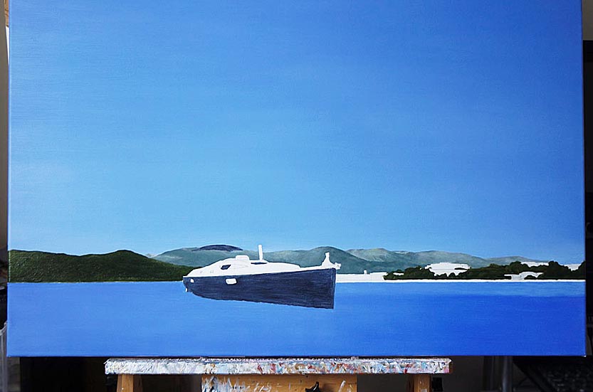
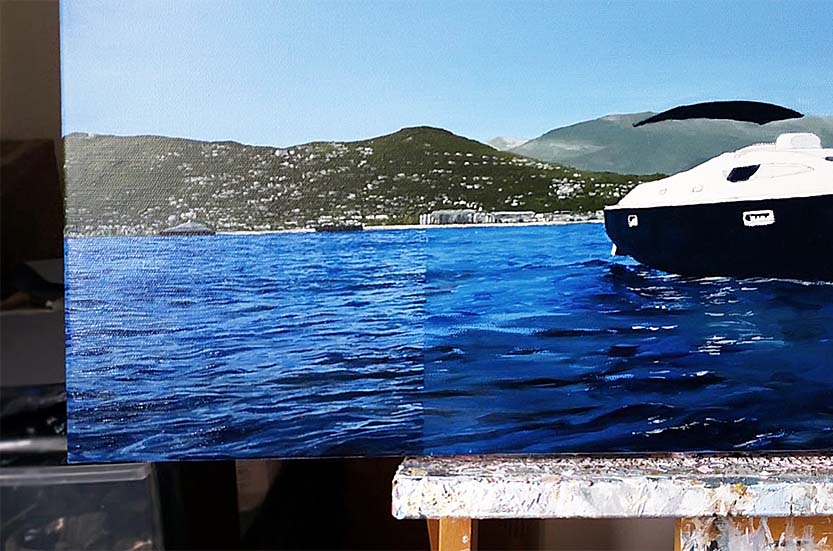
EXAMPLE TWO: PAINTING WATER WITH REFLECTIONS

A Painting of Port Grimaud, Saint Tropez, Southern France
When I began working on the water in this commission, I knew it would be one of the most important aspects of the painting. The luxurious boat and elegant home at Port Grimaud, Saint Tropez, Southern France, were, of course, the central subjects, but without convincing reflections in the calm water, the whole piece would feel flat. My first step was to really observe how the light played on the surface. Calm water doesn't simply mirror objects like a perfect glass; instead, it gently distorts them depending on ripples, depth, and angle of view.
With that in mind, I painted a soft underpainting (the base layer), stretching downward into the water, making sure the proportions matched the shapes of house, trees and garden slightly to mimic the vertical pull of reflections. On the left side of the canvas I used Old Holland Blue-Grey for the reflection of the sky, using a completely different blue than the sky — which I painted with Winsor and Newton French Ultramarine Blue, mixed with Titanium White.
Defining the Water
For the second layer, I decided to define the water with greater detail. I mixed five cooler tones than those I had used above the waterline, and mixed them in a porcelain daisy-design palette with deep wells. For this, I used a mix of Old Holland Blue-Grey, Old Holland Violet-Grey, Winsor and Newton Titanium White (for the lighter areas) and Winsor and Newton Payne's Grey (for darker reflections in the water). Reflections in water often appear darker and slightly more muted than the actual objects. For example, the crisp whites of the boat became a softer grey-blue, while the warm ochres of the house leaned toward a cooler, more subdued version of themselves.
I steadily worked from the left of the canvas, in one-inch columns, toward the right, using a reference photo of the water to guide me. As I worked toward the right of canvas, I added Olive Green to the mix (for defining the reflections of trees) and earth tones for the architectural elements.
Adding Highlights
Even in calm water like Port Grimaud's canals, there is always a bit of movement. Finally, I added highlights with small strokes of a lighter tone, mostly using Titanium White, especially where the sun struck the boat's hull and bounced back onto the water. These tiny accents really brought the scene to life, suggesting sparkle without overworking the surface. My advice for artists is to paint every ripple or detail you see. Aim to capture the effect of water: the softened colours, the subtle distortions and the interplay of light. Once you step back, you'll find the reflections appear more real.
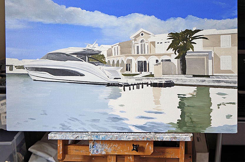
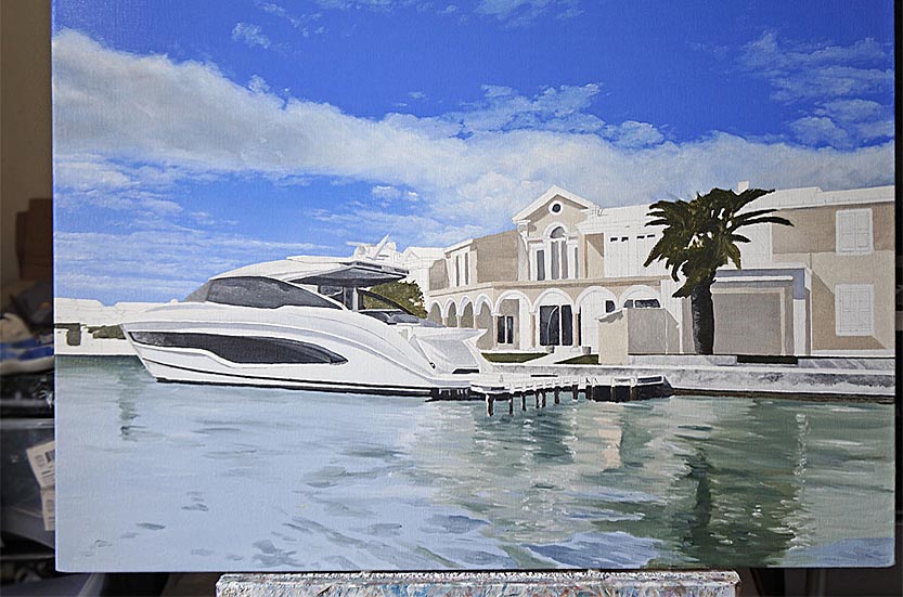


When I worked on the reflections, on the Port Grimaud commission, I found that by softening edges, cooling the colors, and breaking up the mirrored forms with intricate ripples, the water took on a natural, believable presence. My encouragement to you is this: approach water with patience, allow yourself to experiment with layering and also glazing, if you feel it will improve the look of the water. With practice, you'll find that your reflections not only anchor your subject but also add an interesting, luminous quality to the entire painting.
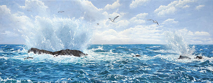
The Varying Colours of the Sea
When I first started painting water in maritime paintings, I imagined it would be simple — a bit of blue here, some reflection there — and the sea or river would appear. But as I've spent more time observing and painting, I've discovered that water is one of the most changeable, enchanting and challenging subjects an artist can tackle. It never looks the same twice. Its colours shift constantly with the weather, the light, and even with the angle from which we're looking. A grey storm rolling in, for example, can turn the water into something moody and almost metallic, while a bright morning sun can scatter light across ripples in shimmering blues and greens.
The images below are meant to show just how varied those colours can be in different maritime scenes. If you look closely, you'll notice how each one captures its own mood. This is the magic of water — it's never static. What interests me most about painting is that it's not about following a strict formula; it's about responding to what you see and, perhaps more importantly, what you feel in that moment.


I know some artists who have their trusted palette and rarely stray from it. There's absolutely nothing wrong with that — many beautiful paintings have been born from consistency and restraint. But personally, I enjoy giving myself permission to experiment. I'll reach for colours I wouldn't normally use, or I'll mix unexpected hues just to see what happens. Sometimes it works beautifully, sometimes less so, but either way, I learn something new.
For me, flexibility with colour is part of the enjoyment of painting water. By allowing myself to explore, I bring a fresh perspective to each piece, and I hope that curiosity shines through to the viewer. After all, no two seas are alike, no two skies reflect in quite the same way, and no two paintings should feel bound to a rigid formula. If you're learning to paint water, I encourage you to mix, to shift, and to surprise yourself. That freedom is where the wonder happens.
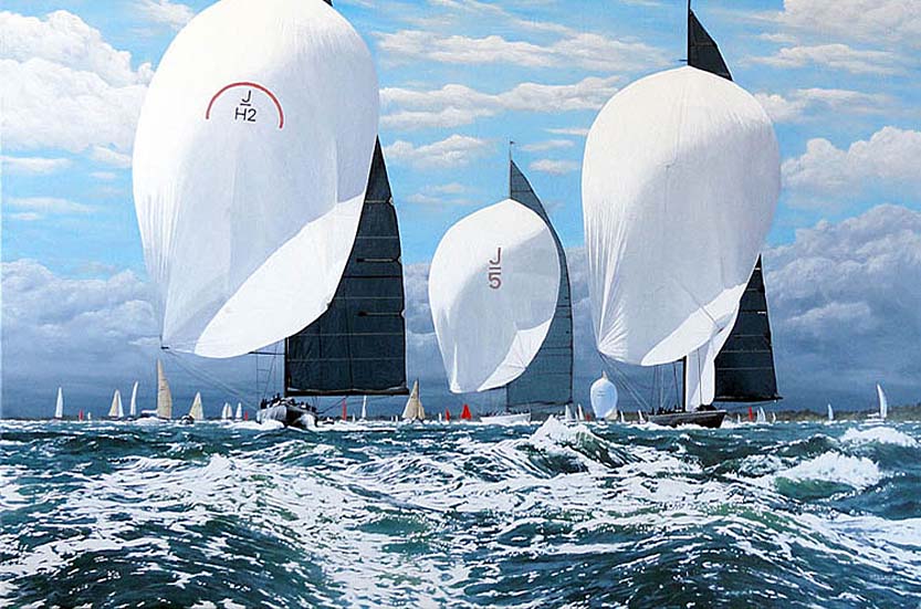
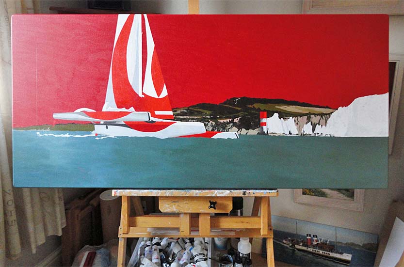
EXAMPLE THREE: PAINTING SWELL

Painting a Racing Trimaran
When I set out to paint the racing trimaran off the Needles, Isle of Wight, I knew the real challenge wasn't just in capturing the sleek lines of the boat, but in conveying the restless energy of the sea itself. Waves are never still — they breathe, shift, and catch the light in fleeting ways. My goal was to capture that living rhythm in acrylics, so the water wouldn't just be a backdrop, but a force that carried the story of the painting.
I began, as I often do, with a base layer for the water. This first wash of colour set the mood and gave me a surface I could build depth upon. Once it dried, I carefully marked out a grid of one-inch squares in pencil. This 'squaring up' method might sound a bit methodical, but it gave me a reliable guide as I worked across the canvas from left to right. It kept the proportions of the wave patterns consistent while still allowing me the freedom to interpret the sea's movement.
Painting Water
For the water itself, I turned to a limited palette that I've found beautifully versatile. Because this was an acrylic painting, I used Old Holland's New Masters Classic Acrylics Payne's Grey to give me a deep, moody foundation, while Olive Green brought a subtle warmth to the shadows of the swell. To these, I added Liquitex Professional Heavy Body Acrylic Phthalocyanine Blue (Green Shade), which gave the sea its sharp, cleaner tone. Layer by layer, these colours began to echo the weight and translucence of real water.
The third layer was where the sea truly started to come alive. By mixing in Schmincke PRIMAcryl Finest Artist Acrylic Titanium White (a very good opaque acrylic white paint), I lightened sections of the water just enough to create mid-tones and gentle highlights. This part required patience and restraint. It's always tempting to go too bright too quickly, but the balance between dark depth and luminous crest is delicate. I wanted contrast, yes, but not at the expense of subtlety. So I slowed down, carefully adjusting until the water began to come together with believable movement.
Painting Wave Foam
For the wave foam, I went directly to pure Titanium White. To capture the spray, I reached for one of my favourite unconventional tools: a toothbrush. By running my thumb along the bristles, I was able to flick fine specks of paint across the canvas, placing them where they would be most effective in the scene. This simple technique gave added realism to the waves and their sense of energy and spontaneity.

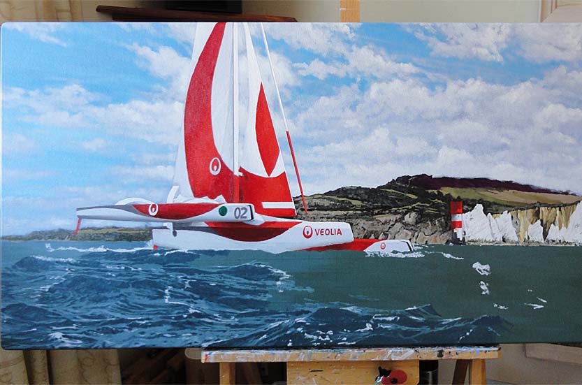


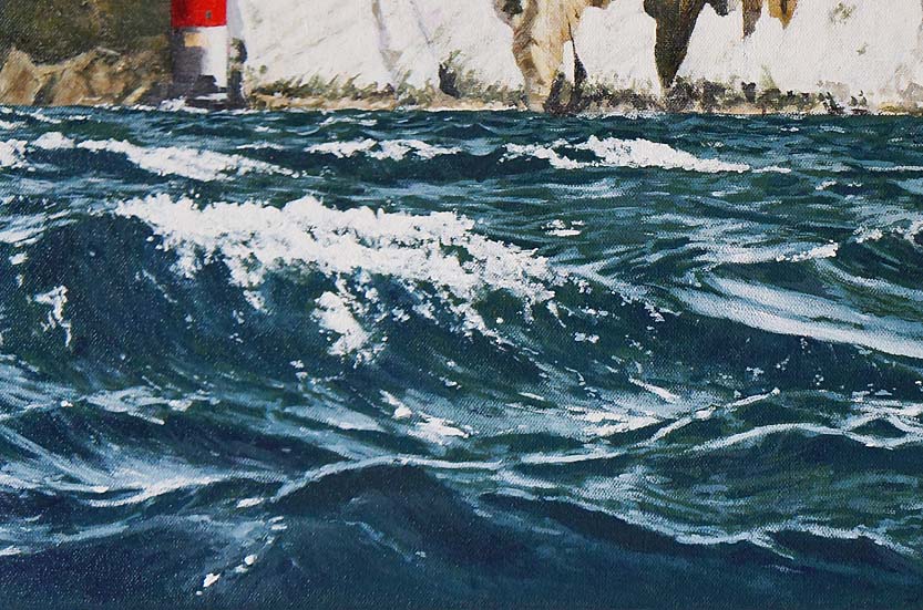

In the end, painting this seascape felt like collaborating with the elements themselves. Every layer, from the darkest underpaint to the final spray of foam, was about listening closely to the sea and translating its rhythm onto canvas. The trimaran races through the scene, yes, but it's the water that tells you just how exhilarating that journey must have been.
EXAMPLE FOUR: PAINTING OCEAN WAVES
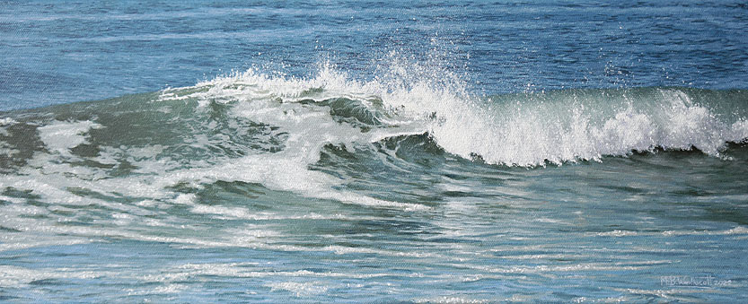
The wave painting above was inspired by a photo I took at Croyde Beach, North Devon. The waves were rolling in at six to eight feet in height on that particular occasion, with an off-shore wind. I wanted to use a different set of colours to what I normally use for depicting water in artworks, and chose to use black on this oil painting (which I have never used before when painting water). The results were better than I expected; and I used the same colour combinations for two more paintings inspired by the waves at Croyde Bay.
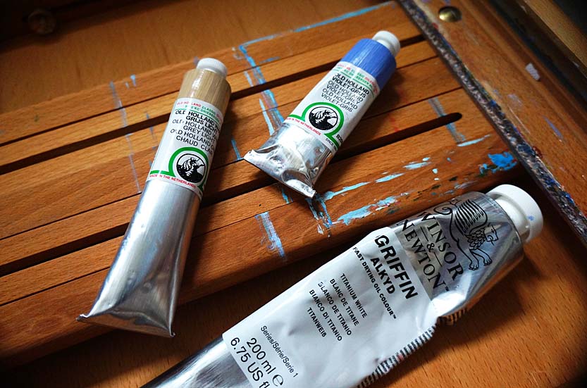
Oil Paints
It is well known that the same colour can vary slightly between different paint brands, so I will add the brand name as well as the paint colour. You will then be able to match the colouration as closely as possible to my painting. I used Old Holland Classic Oil Colour paints and Winsor and Newton Griffin Alkyd Oil Colour paints on this particular painting.

When I set out to paint the movement of ocean waves, I wanted the colours to feel alive — shifting, layered, and full of energy, just like the sea itself. For the foam trails, I began with Old Holland Blue-Grey, softening it with just a touch of Winsor and Newton Olive Green. This gave the foam a subtle, natural tint that kept it from looking too stark against the rest of the painting.
For the body of the wave, I built a mixture that felt deep and luminous: Winsor and Newton Olive Green, Terre Verte, and Prussian Blue. Together, they created a beautiful, rolling green-blue that really captured the sense of water in motion. To push the shadows deeper in certain areas, I added just a hint of Winsor and Newton Ivory Black — it darkened the mix without dulling the vibrancy.
The sea beyond the wave needed a slightly different treatment. For those flatter areas at the top of the painting, I leaned more heavily on Winsor and Newton Prussian Blue and Cobalt Blue, softening the depth with a little Ivory Black. To catch the lighter passages, I mixed in Old Holland Blue-Grey, which helped me create a gentler shift in tone, suggesting the sky's reflection on the water's surface.
For the breaking foam of the wave, I wanted a shadow colour that still felt delicate. Old Holland Violet-Grey, blended with Old Holland Warm Grey Light, gave me exactly that — a subtle hue that carried the sense of shadow while keeping the foam light and airy. To finish, I used Winsor and Newton Titanium White to capture those sparkling highlights where the sun hits the crest of the wave and the spray of the sea foam.
One small note about working with white: if you're chasing that dazzling brightness of sunlight on water, it often takes a little persistence. I found myself layering the Titanium White four or five times before reaching the level of intensity I was after. The build-up gave the highlights a richness and glow that felt true to the light of the ocean. Painting onto a primed white canvas, without using another colour as a coloured ground, prior to underpainting, helped with the intensity of the luminosity of the white foam.
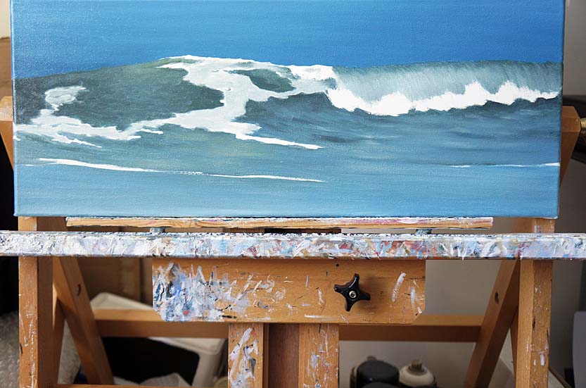
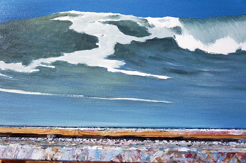
Work-in-progress Images of the Painting
The images below walk through the stages of this process, showing how each layer slowly builds toward the finished wave. It's a patient, almost meditative process, and for me, it's one of the most rewarding parts of painting the sea.


Painting Spray
I used Titanium white paint for the spray. For the main blobs of spray, I used the pointed tip of a wooden cocktail stick and tapped it gently onto the canvas. For the fine spray, I used a toothbrush (ideal because of its short bristles) and dabbed it into Titanium White paint and (using my thumb) rubbed it over the bristles and flicked fine flecks of paint onto the canvas. Before doing this, I masked off areas of the painting where I did not want any spray, using paper and masking tape. I directed the brush accordingly, close to the canvas, aiming it toward the areas of the painting where I wished to create the fine spray. The combination of fine spray and the slightly larger white blobs (created using the cocktail stick) are what brought together a sense of realism, that could draw the viewer in and make the scene feel believable.
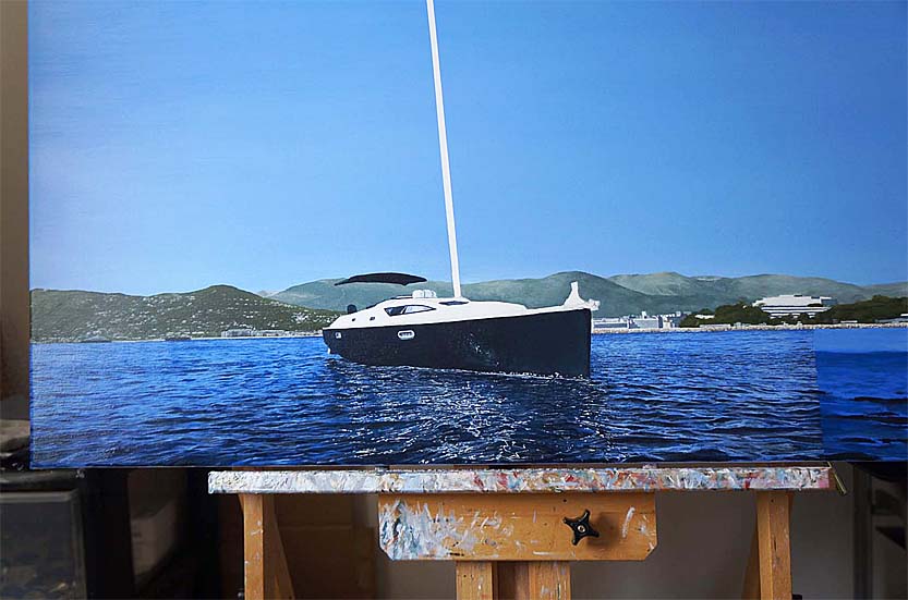
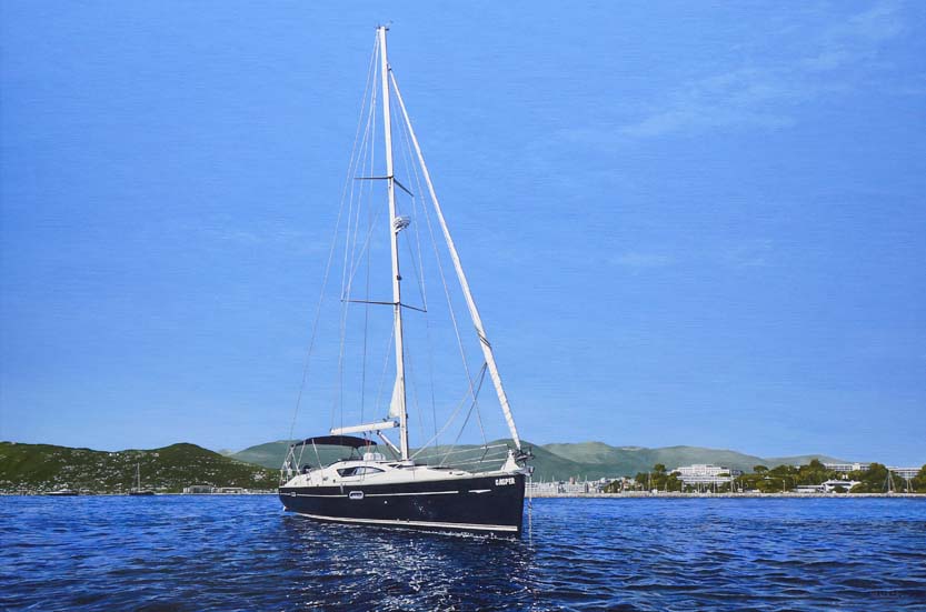
EXAMPLE FIVE: PAINTING CALM MEDITERRANEAN WATER

Painting a Jeanneau Sun Odyssey 42DS yacht
This painting depicts Casper, a stunning Jeanneau Sun Odyssey 42DS yacht, anchored off the beautiful city of Nice, South of France. This oil painting was a wonderful commission to work on. There was a lot of detail painted in this picture and technical accuracy was important in portraying the yacht at anchor. The deep blues in this painting really brought to life the vibrancy and the quality of the sky and sea. I enjoyed painting the water and bringing together all the separate details and elements that added to the final realism of this artwork.
Oil Paints
For this painting, I used Michael Harding oil paints, Old Holland Classic Oil Colour paints and Winsor and Newton Griffin Alkyd Oil Colour paints.
When I began painting the water, I laid down a thinned base of French Ultramarine. This first wash may have seemed simple, but it set the stage for everything that came after, as you will see in the images below. At this point, I also marked out where I wanted the ripples to sit, just a gentle suggestion of movement across the surface — nothing too bold yet — this stage was all about preparing the canvas for the layers to come. The water always looks a little basic in the beginning, but I've learned to trust the process; as it gains refinement with every pass of the brush.
For the main mixes, I worked with Winsor and Newton Griffin Alkyd Ultramarine Blue, Titanium White, and Payne's Gray. These three paints gave me the flexibility I needed to capture both the cool depths and the sparkling surface of the sea. To make the paint more fluid, I added a non-toxic medium — Sennelier 'Green for Oil' Universal Medium — which kept the blends smooth and responsive under the brush. I created seven different shades from these colours, adjusting the ratios to give me everything from the deepest blues to the crisp white highlights. That range of tones was essential to bring the water to life.
I painted methodically, almost meditatively, spending days working across the canvas in one-inch columns, moving from left to right. Using a very fine size '0' round brush, I built up the surface little by little, paying close attention to how the ripples flowed and how the light would catch them. This steady, deliberate approach allowed me to layer the colours gradually, blending and softening as I went. Each column became a miniature study in movement and reflection.


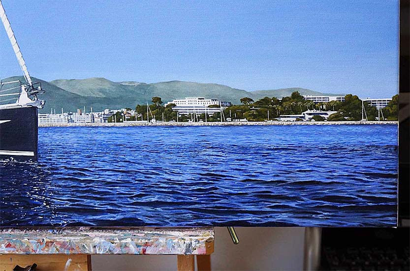
As the painting developed, I went back and refined areas that felt too flat, carefully repainting sections of the ripples to sharpen their definition. I also intensified the reflections with Titanium White, which added a subtle shimmer to the surface. The result is a depth of blue that feels both natural and dynamic — calm, but alive with the play of light. Standing back now, I'm really pleased with how the water has turned out. It has the quiet realism I was aiming for, and it carries the sense of the Mediterranean sun glinting off the surface, just as it does off Nice's sparkling coastline.
Summary
The following summary provides my final advice to artists wishing to paint realistic-looking water in seascapes and maritime artworks. I hope the information I have provided on my blog post page will be of help to you on your artistic journey. For me personally, it has been a case of practise by trial and error. I completely taught myself how to paint water, by exploring colour and technique, to discover the method that worked best for me. I have learned patience along the way, which is no bad thing when you become an artist, and I have learned that when mistakes do happen and areas of a painting need to be reworked or started again, it often leads to a better, and sometimes unexpected, result. So never give up, never become annoyed or disappointed; and if you do, let it pass and don't dwell on the emotion or thoughts you're feeling. Patiently return to the painting and improve it; for it is still waiting for you to make it whole and complete.
Artist Recap
1. Draw your composition. Begin with a light drawing of your maritime scene, marking the horizon line and general wave shapes. 2. Block in base colours. Apply thin washes of blue and green tones to create the underlying colour of the sea. 3. Develop wave forms. Use detailed brushstrokes to suggest movement and form of ripples and waves, layering midtones and highlights. 4. Refine details and highlights. Add further detail and highlights to wave crests, spray, reflections, and foam patterns to enhance realism. 5. Final adjustments. Glaze areas of the water to deepen colour and add subtle transitions for a lifelike finish. 6. Drying and Varnishing. Once an oil painting is complete, allow it to dry for a minimum of four weeks before applying a protective coat of artists' retouch varnish — that's if you can't wait twelve months for a final varnish and need to exhibit your painting or sell it quickly. This not only safeguards the surface but also enhances the depth and vibrancy of the colours, giving the work a unified finish. The retouch varnish will still allow the drying process to continue even though the painting may feel dry to the touch on the surface. A final varnish can be applied to an oil painting after twelve months; by then, the paint layers will have dried. The final varnish will then protect the paint layer safely.
Thank You For Reading
I want to take a moment to express my deepest thanks to you for visiting my website and for taking the time to view my Blog post. Each piece I create is inspired by my love for the sea — the shifting light on the water, the moods of the weather, the timeless beauty of yachts and coastlines. Knowing that you have spent some of your valuable time exploring my work means more to me than words can say.
To those who have chosen to collect my paintings, please know that your support goes far beyond the purchase itself. You are not only investing in the artwork but also in the countless hours, dedication and care that go into creating each piece. From the first spark of inspiration to the final brushstroke, my aim is always to capture the essence of the maritime world with professional craftsmanship and authenticity. Your appreciation of that effort is both humbling and deeply encouraging.
Art is a conversation between the artist and the viewer, and I feel truly privileged to share that connection with you. Whether you are simply enjoying the images online or have welcomed one of my paintings into your home, you are part of the journey that keeps my creative spirit alive. For that, I offer my heartfelt gratitude.
Intellectual Property
All images, text, and design elements on this website are the intellectual property of Mark Woollacott unless otherwise stated. Unauthorized copying, reproduction, distribution, broadcasting or use of any content — whether for commercial or personal purposes — is strictly prohibited. Please respect English and international copyright law.