
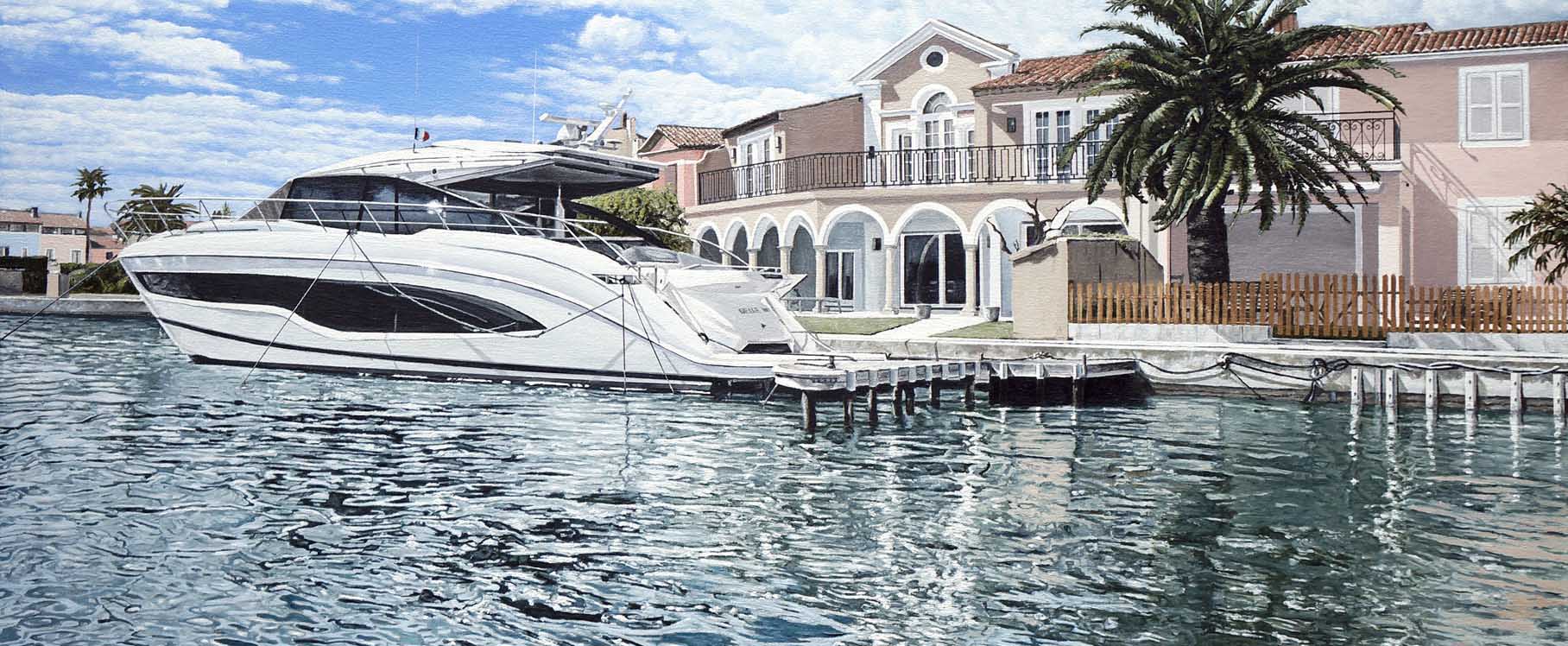
An Artist's Depiction of Port Grimaud, Saint-Tropez, French Riviera
Port Grimaud is a colourful, affluent coastal town with canals, inspired by Venice and designed by sailor, François Spoerry. It is located seven km west of Saint-Tropez, on the French Riviera, between the well-known cities of Nice and Marseille. Construction of Port Grimaud began in 1966. What was once an area of marshland, became developed into the vision of beauty it is today.
Symbol of Luxury & Exclusivity

This painting was the result of a commission I painted in 2023. The painting was a generous and heartfelt gift for my client's best friend, to mark his 50th birthday, hence the painting's title Half a Century. It had been a dream for the friend to one day achieve a number of goals in his life and one of them was to work hard all his life and to one day own a boat and to live with his wife at Port Grimaud on the French Riviera.
I was originally contacted before 2023 about the proposed painting, but had to wait until renovations had been completed on the facade of the house, including it being repainted with a new colour scheme, before new photographs could be taken of the property and emailed to me; which I would later use for reference purposes when painting the picture.
The painting was painted with high quality oil paints onto a 24 x 36 inch cotton canvas. The brief was to depict the boat in front of the house. This painting was not only a statement, a symbol, of my client's friend's personal achievement and success, but was also a metaphor showing how dreams can come true.


Creating the painting
When I began working on the water in this commission, I knew it would be one of the most important aspects of the painting. The luxurious boat and elegant home at Port Grimaud, Saint-Tropez, on the French Riviera, were, of course, the central subjects, but without convincing reflections in the calm water, the whole piece would feel flat. My first step was to really observe how the light played on the surface. Calm water doesn't simply mirror objects like a perfect glass; instead, it gently distorts them depending on ripples, depth, and angle of view.
With that in mind, I painted a soft underpainting (the base layer), stretching downward into the water, making sure the proportions matched the shapes of the house, trees and garden, to mimic the vertical pull of reflections. On the left side of the canvas I used Old Holland Blue-Grey for the reflection of the sky, using a completely different blue than the sky — which was painted with Winsor and Newton French Ultramarine Blue, mixed with Titanium White.


Defining the Water
For the second layer, I decided to define the water with much greater detail. I mixed five cooler tones than those I had used above the waterline, and mixed them in a porcelain daisy-design palette with deep wells. For this, I used a mix of Old Holland Blue-Grey, Old Holland Violet-Grey, Winsor and Newton Titanium White (for the lighter areas) and Winsor and Newton Payne's Grey (for darker reflections in the water). Reflections in water often appear darker and slightly more muted than the actual objects. For example, the crisp whites of the boat became a softer grey-blue, while the warm ochres of the house leaned toward a cooler, more subdued version of themselves.
For many days, I steadily worked from the left of the canvas, in one-inch columns, toward the right, using a reference photo of the water to guide me. As I worked toward the right of canvas, I added Olive Green to the mix (for defining the reflections of trees) and earth tones for the architectural elements.
Adding Highlights
Even in calm water like Port Grimaud's canals, there is always a bit of movement. Finally, I added highlights with small strokes of a lighter tone, mostly using Titanium White, especially where the sun struck the boat's hull and bounced back onto the water. These tiny accents really brought the scene to life, suggesting sparkle without overworking the surface. My advice for artists is to paint every ripple or detail you see. Aim to capture the effect of water: the softened colours, the subtle distortions and the interplay of light. Once you step back, you'll find the reflections appear more real.


When I worked on the reflections, on the Port Grimaud commission, I found that by softening edges, cooling the colours, and breaking up the mirrored forms with intricate ripples, the water took on a natural, believable presence. My encouragement to you is this: approach water with patience, allow yourself to experiment with layering and also glazing, if you feel it will improve the look of the water. With practice, you'll find that your reflections not only anchor your subject but also add an interesting, luminous quality to the entire painting.
Light and Shade
In order to depict a realistic impression of light in the composition, it was important to paint shadows on the architecture, garden and boat. Because the sunlight was strong, I painted sharply defined shadows to emphasize the intensity of the sunlight. Using paint tones and shades to create shadow, meant I could produce the required amount of contrast in the painting to stop it looking completely flat. For example, when I painted the shadows on the boat's hull, I used a mix of Old Holland Violet Grey and Warm Grey oil paint. I also used this colour for the base layer of some of the clouds. For the darker shadows, on the interior of the boat, I added black to the mix for a much stronger effect. To paint the highlights on the boat, I used Titanium White, straight from the tube.

Layer by Layer
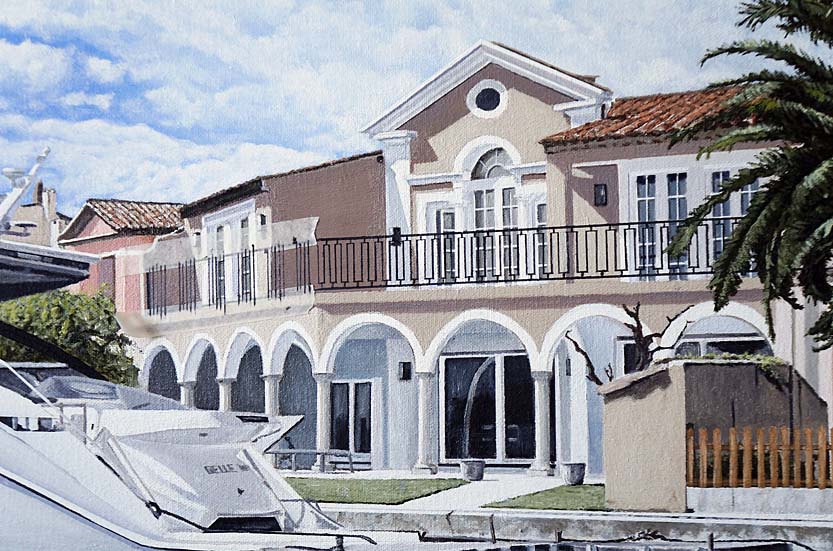
Adding the detail and smaller features in the painting, meant there would be an order to when I painted them. For example, the garden furniture had to be painted before I painted the wooden fence. This method of painting resulted in a much more convincing depiction of those features. The balcony railings and roof tiles had to be painted before I painted the leaves of the palm tree.


Finishing off with detail
To paint the fine lines required for the ornate balcony, I used artist masking tape as a painting aid and guide. This ensured the lines would be perfectly straight and accurate in the painting. When using masking tape, it is important to prevent the paint from bleeding underneath the edges of the tape. Tip: use the tip of a wooden cocktail stick and use it to ensure the edge of the masking tape is firmly adhered to the canvas surface. Remember, the canvas weave is not totally smooth, so use the cocktail stick to press the tape into all the little dips in the canvas weave, and then you will have a perfect painted line when you carefully (slowly and gently) remove the masking tape from the canvas.

Summary
Creating this commissioned painting was a deeply fulfilling experience for me. I had the joy of capturing a moment in time — a glimpse of the charm and gentle beauty of Port Grimaud. But more than just a scenic view, the artwork became a reflection of something far more personal: the shared vision and heartfelt aspirations of my client and her dear friend.
As a gift for his 50th birthday, the painting was destined to hold a special place in his private collection, and I felt truly honoured to help bring that intention to life. At the heart of it all was a beautiful act of friendship. That bond became the true spark behind the canvas, and I remain so grateful to have been chosen to help express it. Being entrusted with such a meaningful piece — one that blends personal story with artistic expression — was a privilege I'll always carry with me.

I hope you enjoyed this insight into the painting of Half a Century. Thank you for reading.
Contact me to arrange your very own bespoke painting commission
Artist Email: info@markwoollacott.com
Frequently Asked Questions
Why is maritime art a smart investment for luxury collectors?
Maritime art has long symbolized affluence, heritage, and exclusivity. Seascapes, especially from established living artists, are tangible investments that hold aesthetic, cultural, and financial value — appealing to collectors who appreciate craftsmanship and legacy.
What makes Port Grimaud, Saint-Tropez a prestigious subject for oil painting?
Port Grimaud, with its Venetian-style canals, luxury yachts, and Provençal architecture, embodies the glamour of the French Riviera. As a painting subject, it connects lifestyle, location, and legacy — perfect for elite collectors and art investors.
Does maritime art complement luxury interior design?
Yes, maritime art pairs well with luxury interiors, especially in coastal homes, yachts, and private collections. Its calming palette and prestigious symbolism enhance high-end environments.
Can I commission a bespoke seascape of the French Riviera?
Absolutely. Mark Woollacott specializes in commissioned maritime oil paintings tailored to collectors' tastes, often capturing iconic views like Port Grimaud, Saint-Tropez in timeless elegance.
Intellectual Property
All images (including those featuring an online image watermark), text, and design elements on this website are the intellectual property of Mark Woollacott unless otherwise stated. Unauthorized copying, reproduction, distribution, broadcasting or use of any content — whether for commercial or personal purposes — is strictly prohibited. Please respect English and international copyright law.